Patek Philippe introduced a new color to its “entry-level” perpetual calendar chronograph, a white gold case with a blue dial At the 2014 Baselworld watch fair. Patek Philippe has been associated with perpetual calendar chronographs for several decades now. Not only was Patek the first to unite both complications in a wristwatch , but the brand even added, in some references, a split-seconds function or a minute repeater to this already prestigious package. 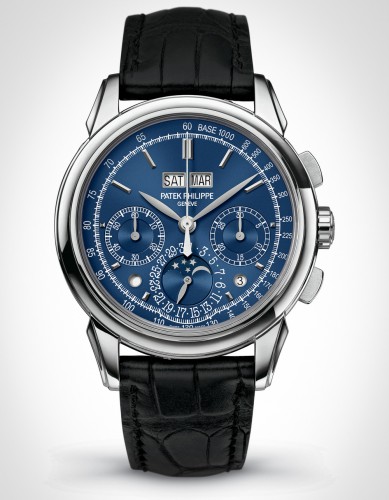 It’s quite difficult to imagine, but the Patek Philippe 5270 is actually the simplest perpetual calendar chronograph of the collection; keep in mind that the two other references with these complications also feature a split-second or a minute repeater . Clearly, though, the 5270 is not a simple watch. It is the latest edition in a long lineage that began with the reference 1518, the world’s first perpetual calendar chronograph, introduced in the middle of the 1940s. This extremely rare bird was produced for only 13 years, in 281 pieces, and features a movement based on a Valjoux ébauche but highly modified and adorned with the Geneva Seal. A few years later, during the early 1950s, Patek Philippe launched the Reference 2499, an improved edition of the perpetual calendar chronograph. Very similar in design, the 3970 and the 5970 came after that, with minor improvements and updated shapes. But in 2011, the 5270 added something very interesting to this classical model: an in-house movement. No more Valjoux or Lemania base here, but instead pure Patek Philippe.
The chronograph does use a column wheel with a vertical clutch for its engagement – the column wheel is, as is usual with Patek Philippe, hidden by a protective cap . The chronograph itself is very classical, with a bi-compax architecture displaying the measured seconds with a central hand, the minutes in a subdial at 3 o’clock and the running second in a subdial at 9 o’clock. Finally, it comes with the precise Gyromax balance wheel, using a free sprung architecture.
The movement is not the only interesting element here, and turning the watch to the dial side also shows complications. The perpetual calendar components are not visible through the sapphire caseback, as they are positioned on the top of the movement. However, the dial provides lots of information, with a clever and legible display. The day and month are indicated in two windows at 12 o’clock. 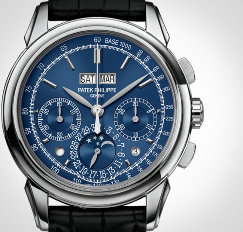
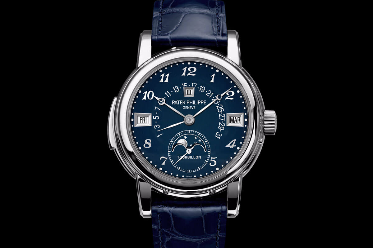
The date and the moon-phase indicator are displayed in a third sub-dial at 6 o’clock. What is new compared to the previous reference is the way it indicates the leap year and the day/night function. Previously, these two were positioned inside the chronograph’s counters at 3 and 9 o’clock and used hands to point out the information. Not the most practical and legible layout, as it was easy to get confused between the different hands. In the 5270, Patek Philippe has chosen to use two small apertures – at 4:30 for the leap year and at 7:30 for the day/night indicator. The dial gains increased legibility and aesthetic purity from that aesthetic decision.
Another change is in the case, which has a diameter of 41 mm instead of 39 mm. It is slightly bigger, but remains in the classical and reasonable category . It is made of 18k white gold and comes with an interesting, typically Patek shape – convex bezel, complicated lugs, and rectangular chronograph pushers. The case remains quite thin at 12.4 mm, and positions itself really well on the wrist. The overall appearance of the Patek Philippe 5270 is refined, complicated and elegant. The minor changes to the design give us a cleaner and more modern watch.
The last of the changes, and also new for 2014, is that blue color combination . Originally available in white gold with a white/silver dial, it is now possible to have the 5270 in blue, a less classical color and perhaps, therefore, easier to wear with a casual outfit as well. Even if blue is a cold color , this new edition is, nonetheless, more appealing. The dial is not plain but slightly guillochéd, with a sunburst pattern, and thus gives off really nice reflections . The contrast with the white gold hands and applied indexes and the white inscriptions is excellent and allows for very good legibility. Furthermore, the blue remains serious enough for Patek’s lovers but adds an extra attractiveness to a very classical reference.